

Home > Design Guide > Story (50/50) Variations
Your internet browser isn't supported.
STORY (50/50 BLOCK) VARIATIONS
The Story 50/50 component offers a flexible two-column layout for combining content and imagery (jpg, png, or gif).
When designing content, you can include an optional top image (logo or icon), title (H1–H4), subtitle, and formatted description with links. You also have the option to add up to two CTAs (links or buttons in primary, secondary, or tertiary styles) and a secondary image to highlight a product or supporting detail.
Line separator color is dependent on the sub-brand and the section background color.
An additional setting allows images to be adjusted to a portrait format for a better fit within the two-column layout.
Simple story component


Story component with sub-image examples

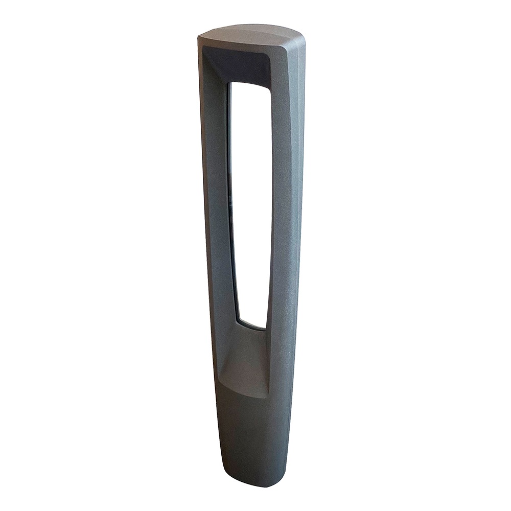
Title (H3)
No character count limit in this description, but be mindful that lots of text will reduce design aesthetics.
App Image Shown: 2400x1350px
Product Image Shown: 600x600px


Title (H3)
No character count limit in this description, but be mindful that lots of text will reduce design aesthetics.
App Image Shown: 2400x1350px
Product Image Shown: 300x300px
Story Component with Logo/Icon and Image


Story (50/50) in two columns
The images shown below are 1982x1114px. The component is responsive and will show the entire image on smaller viewports.