

This guide provides an overview of the website’s components, layouts, and design system standards. It outlines available content options, styling behaviors, and usage guidelines to help authors and stakeholders create consistent, accessible, and well-structured pages across all brands.
Questions? Reach out to the website development team.
Your internet browser isn't supported.
WEBSITE COMPONENT GUIDE
PAGE STRUCTURE
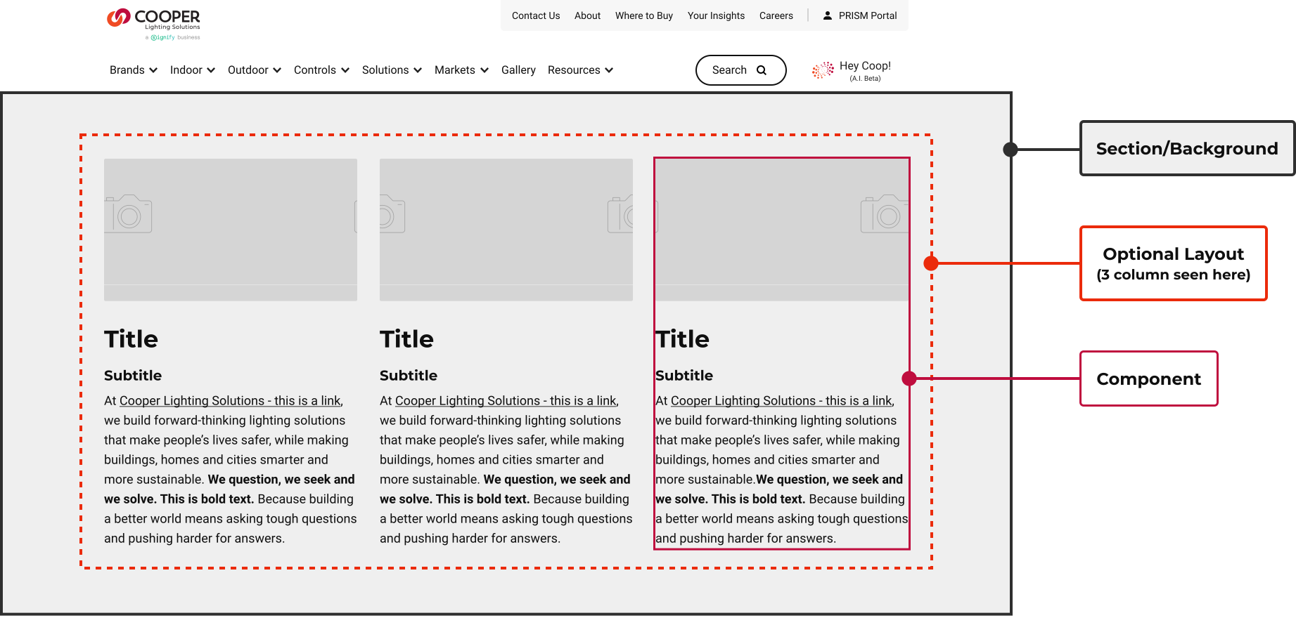
This visual illustrates how content landing pages are structured using foundational building blocks, from section backgrounds and layouts to individual components, showing how each layer works together to create flexible, consistent page designs.
SECTION BACKGROUND COLORS AND CTA LOGIC
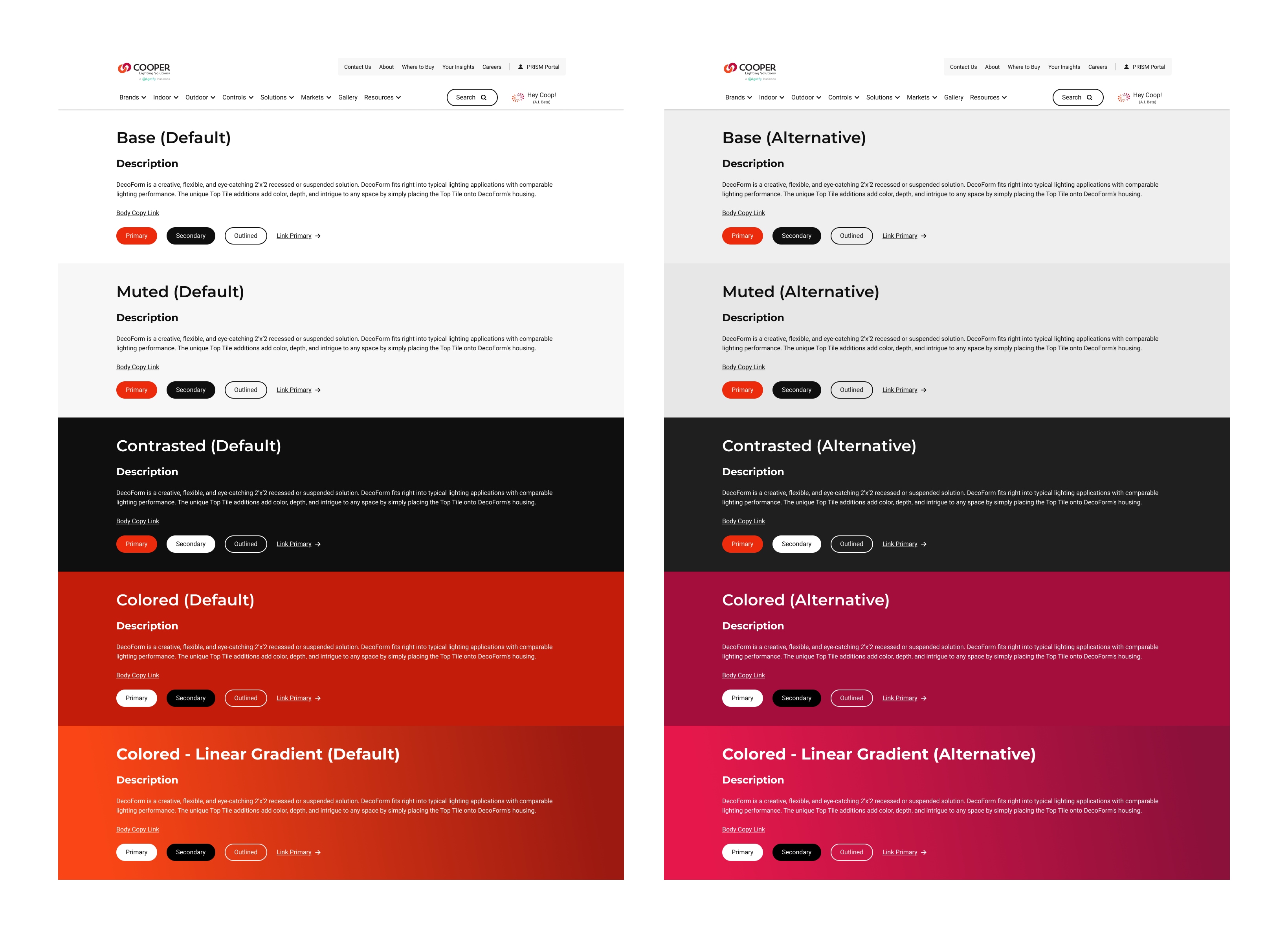
The CLS site includes five default section background options: Base, Muted, Contrasted, Colored, and Colored Gradient, each with an alternate version. Base, Muted, and Contrasted styles remain consistent across all brands, while Colored options are predefined and vary by brand.
Button (primary, secondary, and tertiary) and link styles adjust automatically based on the selected background.
LAYOUTS
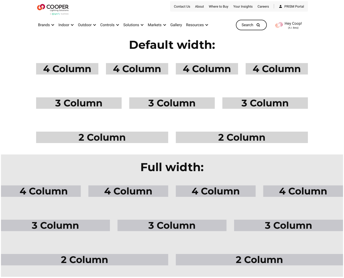
Columns Layout
Some components can be displayed in a column format. Authors can select 2–4 evenly spaced columns, with no option to adjust individual column widths. These components can be displayed in columns:
- Call to action
- Headline
- Image
- Line separator
- Quote
- Story
- Story banner
- Text
- Video
Split Layout (Asymmetric)
Similarly, but with less flexibility, component widths can be adjusted to create an uneven two-column layout, such as an application image taking up 67% of the row and text taking up the remaining 33%. This approach only supports up to two components per row, typically one image and one text block.
TYOPGRAPHY
The site follows a structured typography system for titles and body text. Body copy is consistent across all brands using Roboto Regular, while title styles are driven by each sub-brand’s designated font. For the CLS primary brand, titles are set in Montserrat Bold. See the typography chart for sub-brands.
Title H1 Styling (48px)
Title H2 Styling (40px)
Title H3 Styling (34px)
Title H4 Styling (26px)
Title H5 Styling (24px)
Title H6 Styling (20px)
Text Component Body Text in Roboto Bold (18px):
- Body text (Roboto)
- May use single or double spacing between paragraphs
- May be left, center, or right aligned
- Font may be bold, italicized, and/or underlined
- May use links within this text component
For optimal readability and accessibility, paragraph text should be left-aligned. Left alignment creates a consistent starting point for each line, making content easier to scan and reducing cognitive effort for users.
MEDIA
This site is designed to be responsive, meaning images within components will scale based on screen size. Each component includes recommended image dimensions to help maintain the best visual quality. To support overall site performance, the website may optimize or reduce image quality in certain components.
The site can feature standalone media components, including images/icons (JPG, PNG, SVG, GIFs) and videos. GIFs should be optimized for file size to maintain performance. Videos can be uploaded directly or embedded using YouTube links. Automatically generated video thumbnails can be manually overwritten within the component.


COMPONENTS
HERO-STYLE COMPONENTS
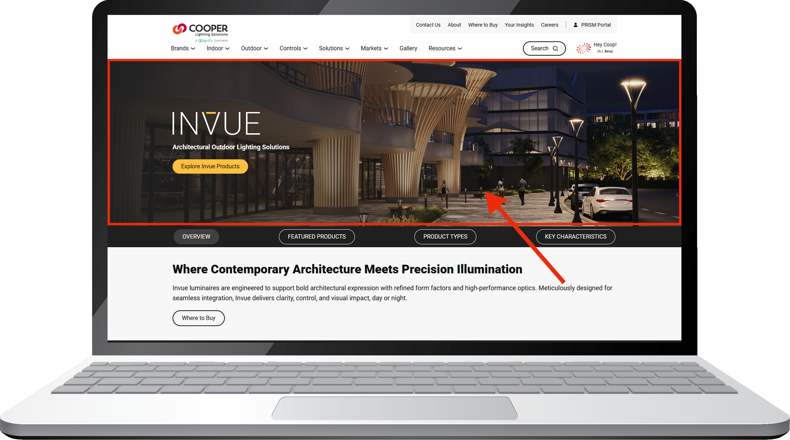
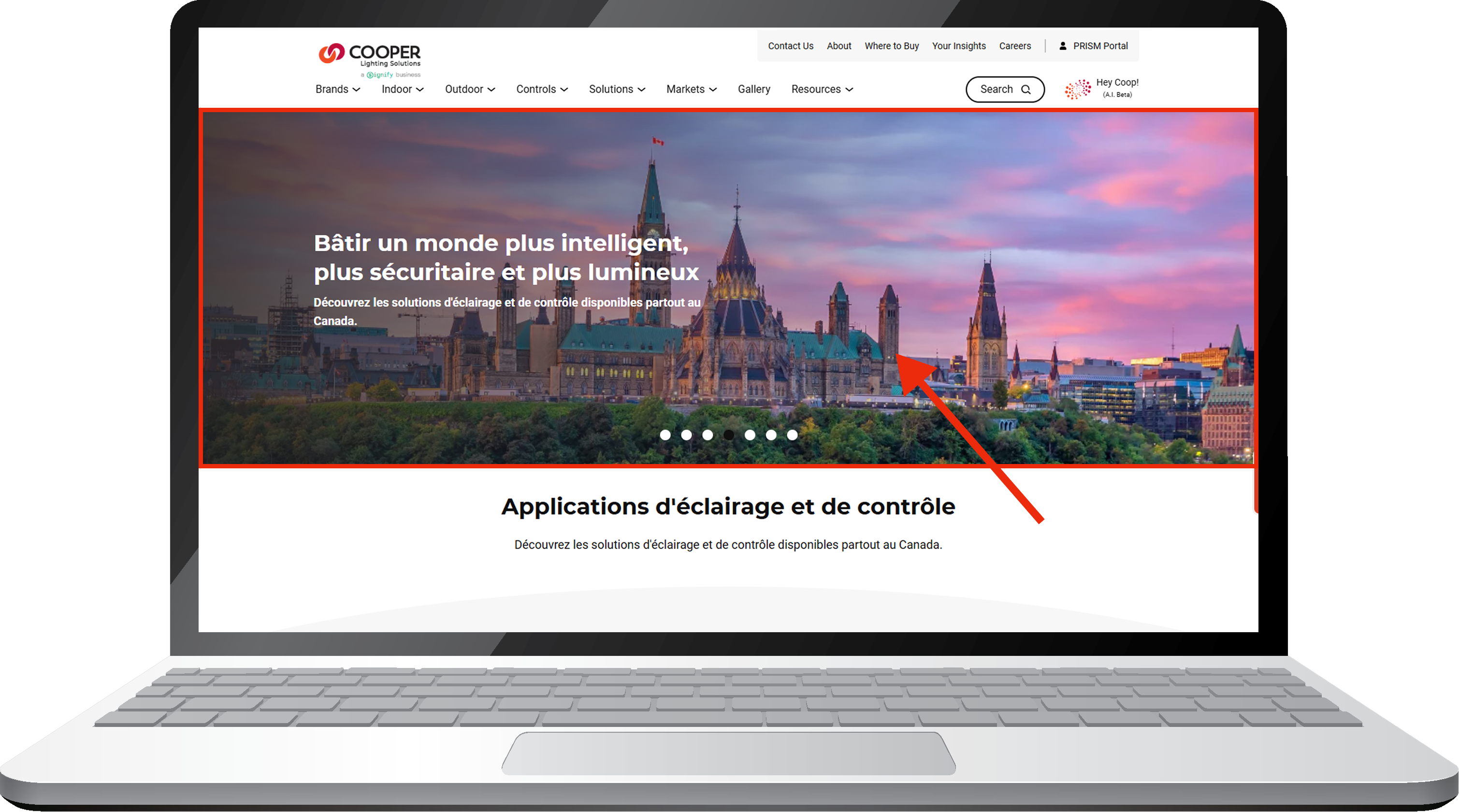
We offer two hero-style components: the Story Banner and the Carousel slider, designed to support different content and storytelling needs.
IMAGERY + TEXT COMPONENTS

Headline Component
A component for combining images or graphics above text. It supports consistent typography and spacing for body copy, subtitles, and captions, with size and style variants to match the design system hierarchy.

Story (50/50) Component
This is a content block designed to showcase a narrative or highlight key information through a combination of imagery and text. The story component includes an image (left or right), title, supporting text, and a call-to-action (CTA) button and/or link. It’s ideal for use in marketing sections, case studies, or featured content areas.
A similar configuration can be created with a content + video + CTA if needed.

Highlight Block Component
A visually focused component that features an image with an overlaid content box containing a title and a link to another page. This component is used to spotlight featured content, promotions, or key site areas.

Variety Story Component
The Variety Story component is designed for visual storytelling with a mix of content and imagery. Authors can add a title, subtitle, and formatted description with links, along with a primary and secondary image. There are no variations of this component.
CARD COMPONENTS
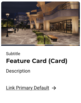
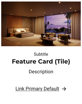
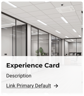
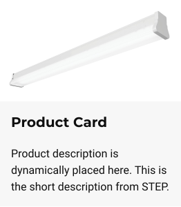
Use these various card components whenever you need to display multiple cards in a grouped section, accompanied by a section link for further exploration. These components are ideal for presenting related content in a cohesive manner, such as stories, articles, products, posts, etc. We currently have four types:
- Story Card: Feature - Card Style
- Story Card: Feature - Tile Style
- Story Card: Experience
- Product Cards
Or, select the card style directly by choosing one of these card types.
ADDITIONAL COMPONENTS:
FAQ (Accordion)
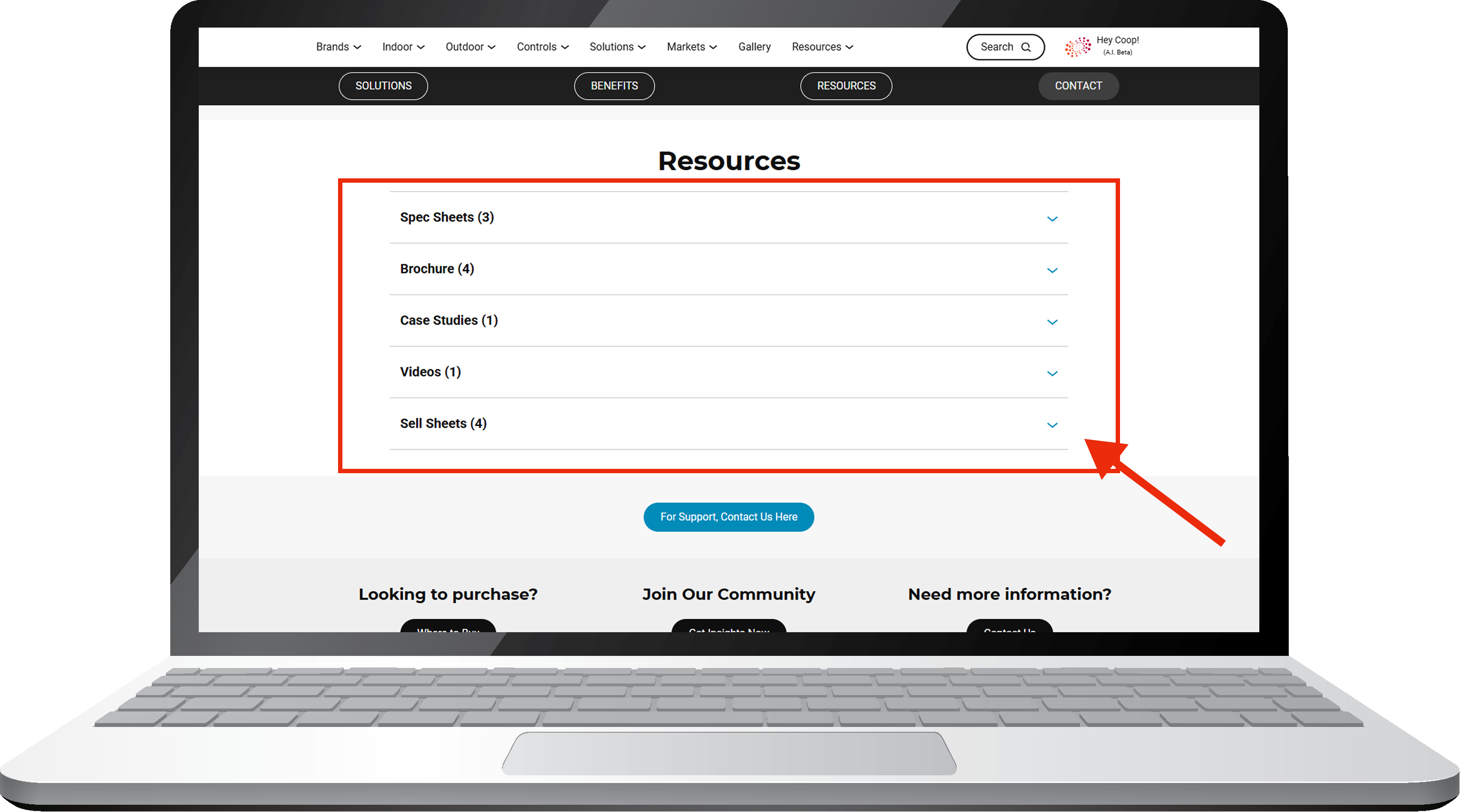
An interactive component used to organize and display frequently asked questions or resources in a collapsible format. Each accordion item includes a question (header) and a hidden answer (content) that expands or collapses when selected.
Testimonial
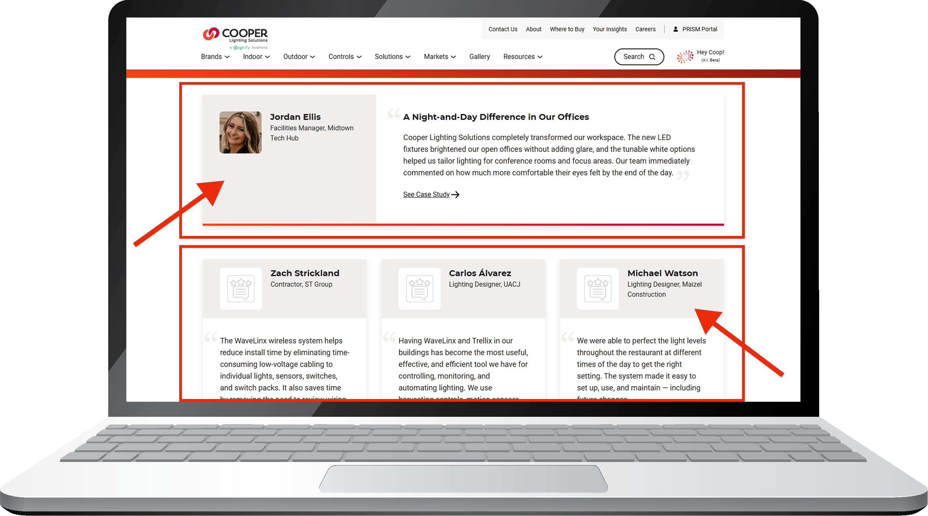
The Testimonial component is used to showcase customer or partner quotes in either a multi-column layout or a scrollable card carousel. Authors can add an image, title, name, and testimonial content.
Quote
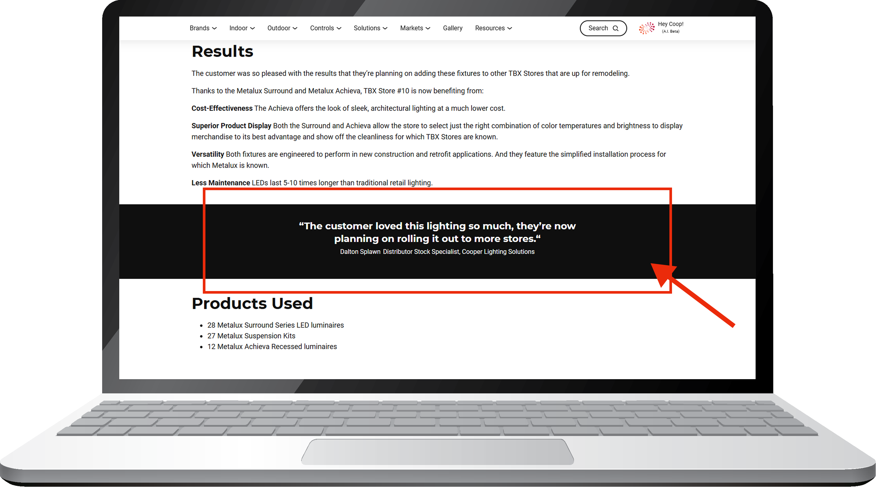
An element designed to highlight a statement, testimonial, or emphasized text. There are no variations of this component other than white/black text, depending on the background color.
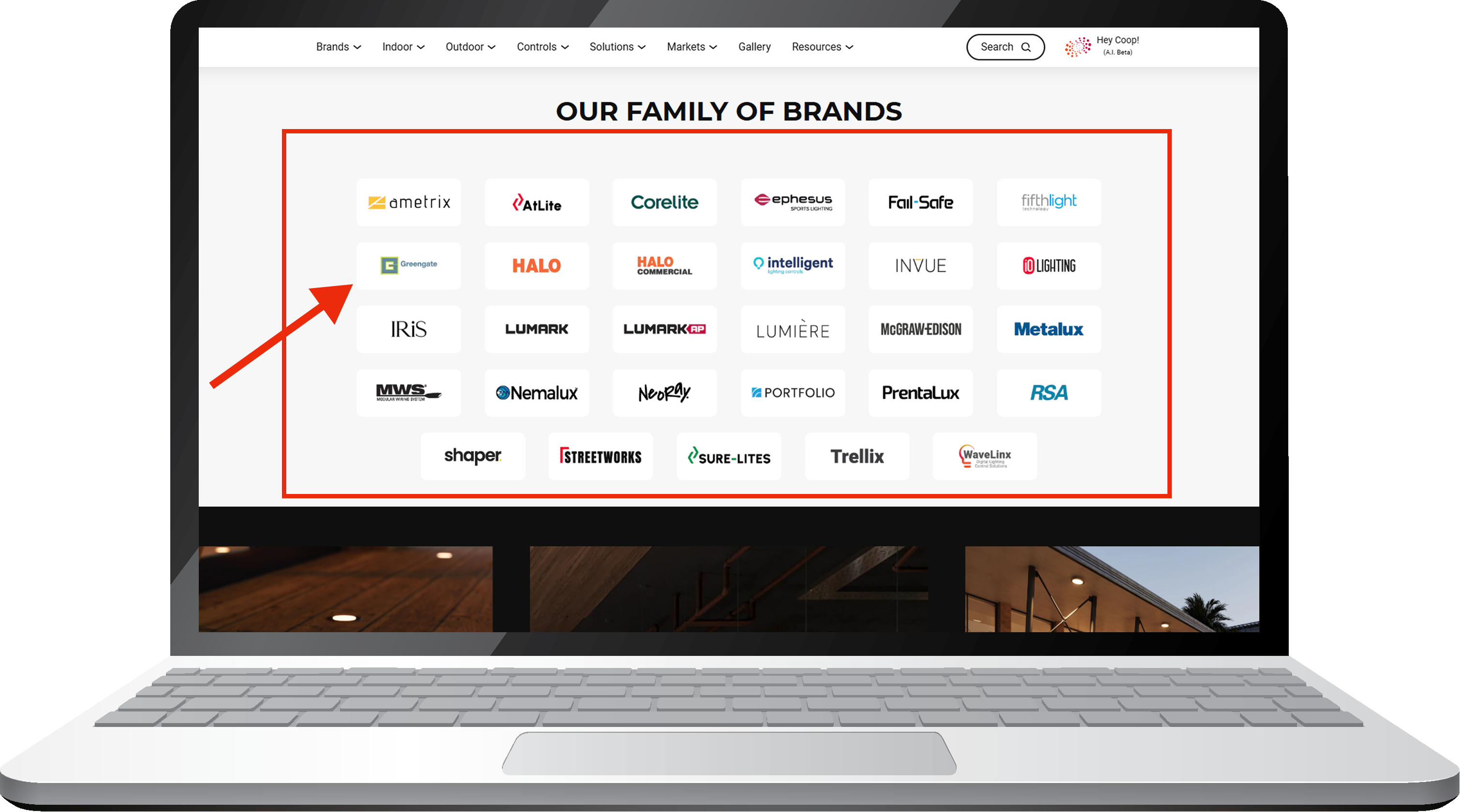
Logo Grid
This is used to display logos or icons in a clean multi-column layout, with up to six items shown per row. Each item can include a link, making logos or icons clickable. The only layout variation is the option to left-align the full component.
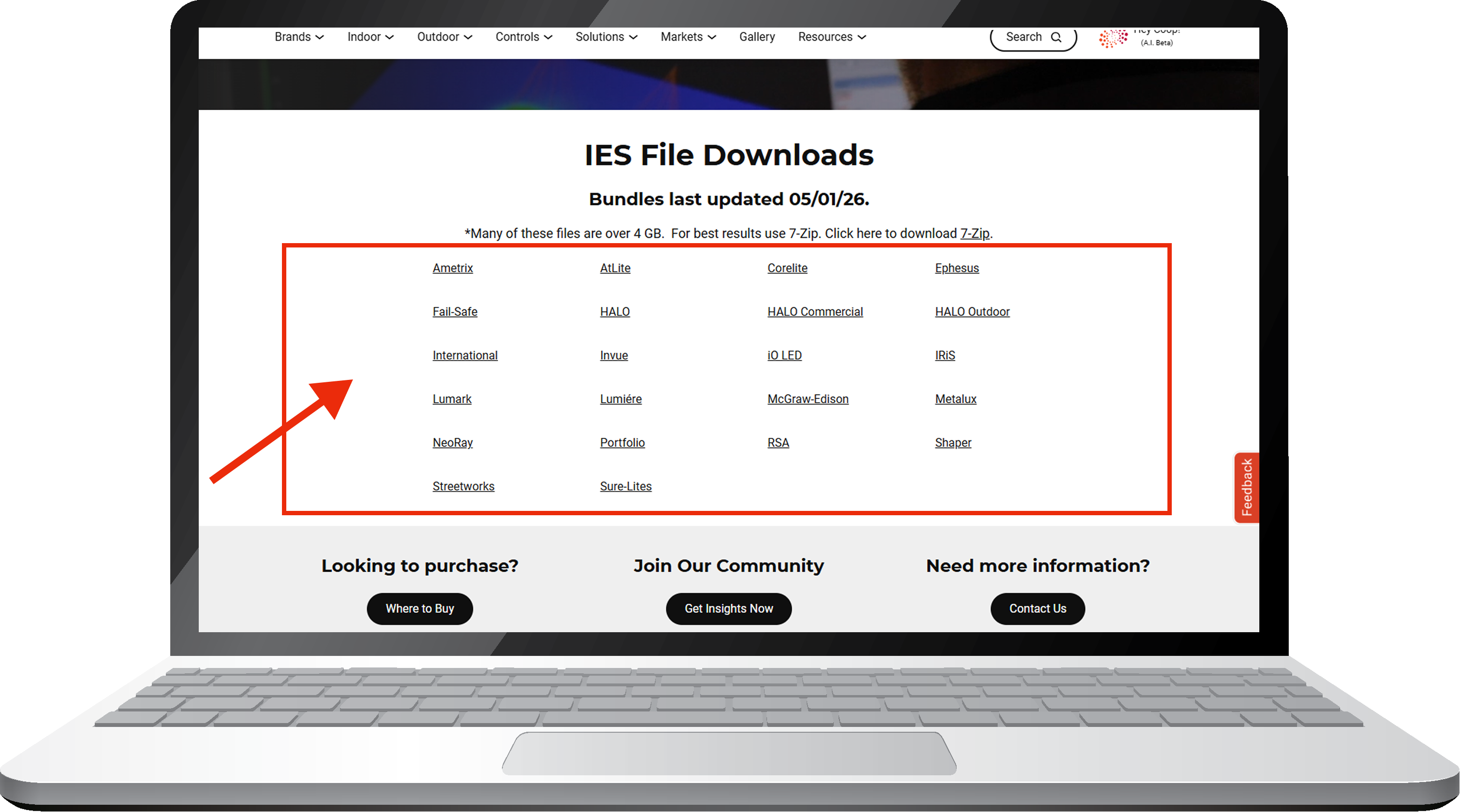
List of Links
This component allows authors to display navigational links either dynamically from a parent folder of child pages in AEM or by creating a manual list. Links are always left-aligned and can be displayed in 1, 2, 3, 4, or 6 columns.
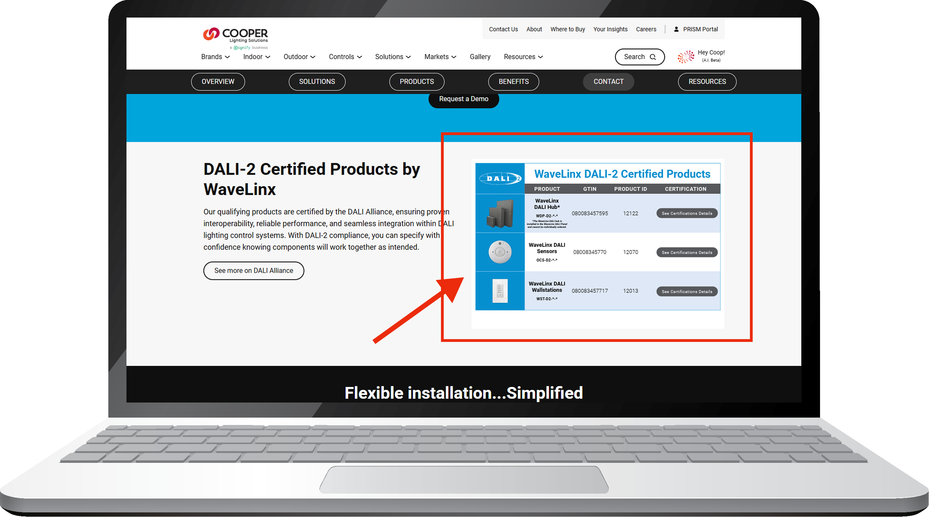
PDF Viewer
The PDF Viewer component embeds a PDF directly within the page, allowing users to view the document without leaving the site. Links inside the PDF remain clickable, making it useful for brochures, guides, catalogs, and other reference materials.